In ~2023, I was part of a team at eBay called the Velocity Initiative. Our charter was to “make software delivery a competitive advantage” for the company. It was very successful on the metrics and less so on the culture. My part was to link up with the ~700 payment engineers to improve their delivery practices.
Throughout that process, we talked about many of the common things that were written about in Accellerate (and many other places since): small batches, delivered frequently, through increasingly automated means with no humans in the deploy process.
When I would sit down with teams, we would work through their metrics around time to deploy, how long reviews took, etc. It was a bit laborious until we got better tools.
This week I had the opportunity to dive in with another team on their software delivery trends, and came up with what I think are some pretty interesting visualizations with claude.
Trace view#
Anyone who has looked at modern telemetry data knows a trace view. This was a natural one for me. We model each initiative as a span. Each of those initiatives have epics (sub-spans) which contain stories (sub-spans). Those stories are implemented via pull requests (sub-spans). Each individual pull request has a start time, review time, approval time, merge time, deploy time. Subspans all the way down. This allows a deep view into what software delivery actually looks like. It highlights waste and delay quite well. I showed a version of this at work and the question was “Why did we spend 10 days waiting on a feature that took ~30 minutes of dev work?!”. The trace shows you.
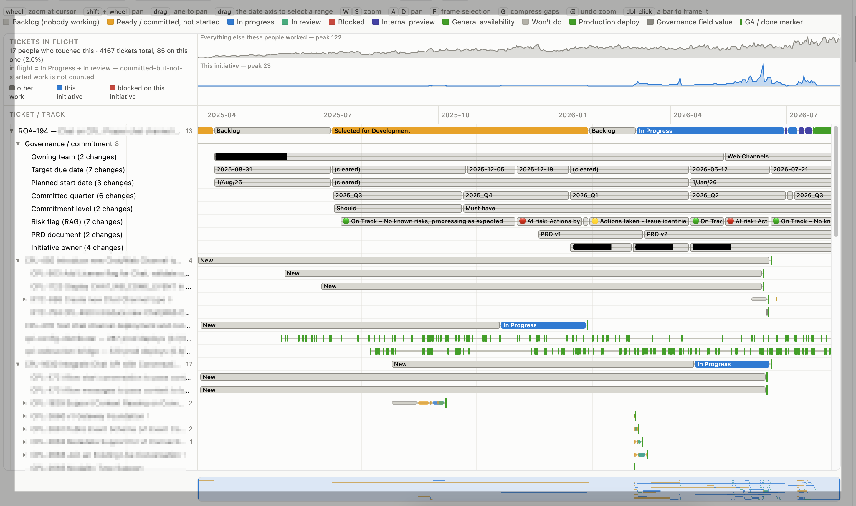
If we zoom in, we can also see wait states on the pull requests themselves. Waiting for review and the wait on clicking the “approve for production” button in the pipeline.

Keeping an eye on WIP#
Focus is also a key aspect to getting work done quickly. If we spread our attention across many things, any individual thing takes longer. So with an eye towards reducing cycle time, I created a ridgeline plot / joyplot which shows every person who touched an initiative over its lifespan. It shows the jira tickets marked as in-progress for them. If the ticket is associated with the initiative, we color it blue. If it’s blocked, red. Otherwise, grey. This shows how people focused on this initiative over time and is super interesting to me from a WIP tracking view.
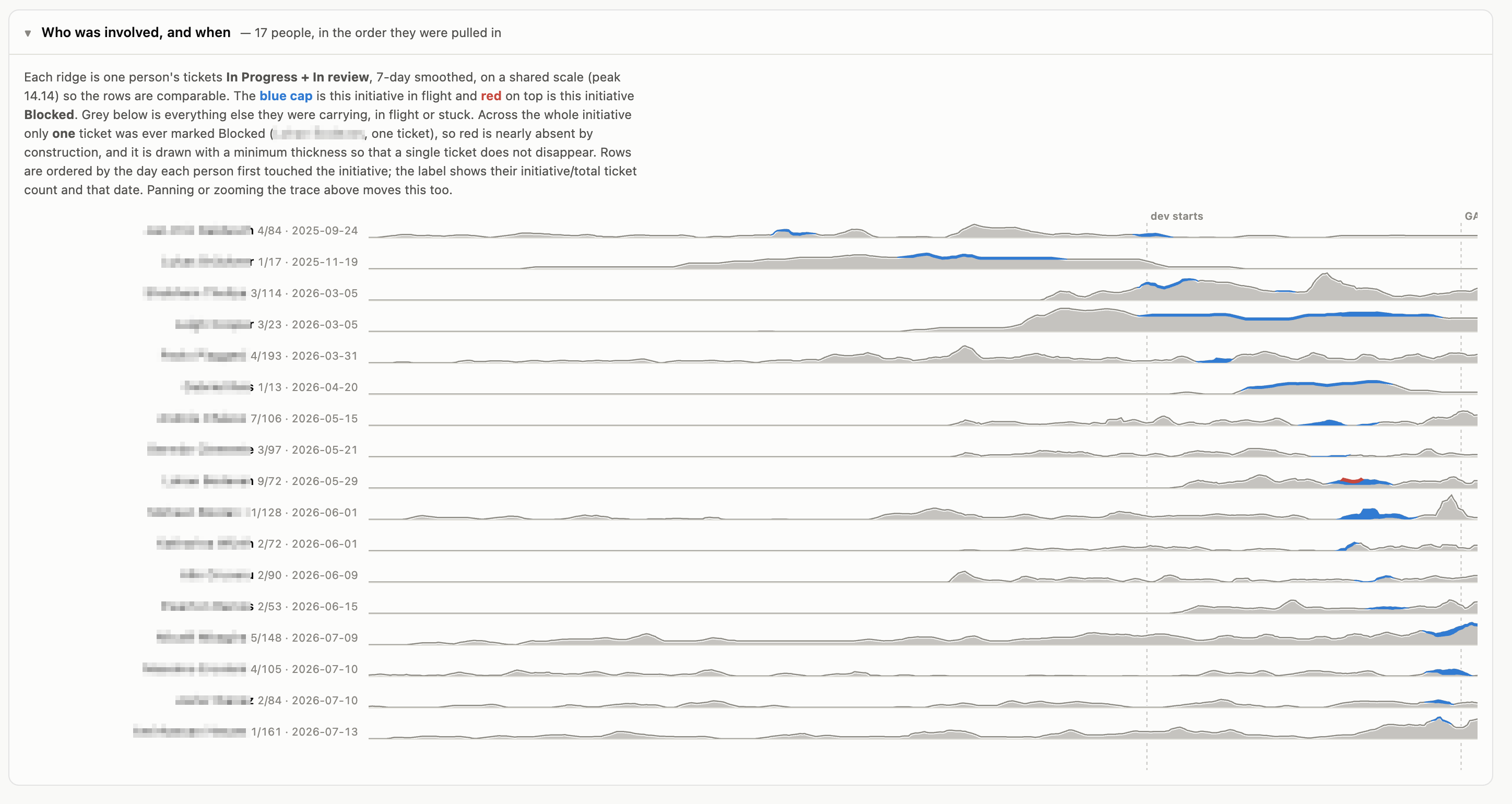
I would love to have had this tool when I was doing this group debugging at eBay. I’ll have to settle for using it from now on.
If you want your own, try a prompt something like this:
I want to see where the time actually went on initiative ABC-123. Pull the data yourself from the Jira and GitHub MCP servers I have connected — don’t ask me for a CSV.
Gathering. Start at the initiative and walk down: initiative → epics → stories/bugs → pull requests. For every issue, fetch the full changelog, not just created/resolved — I need every status transition with its timestamp and who made it, plus assignee history and any blocked flag or blocking link. For pull requests, get created, first review, each approval, merge, and the deploy that carried the merge commit. Link PRs to issues by the issue key in the branch name, PR title, or body, and tell me which PRs you couldn’t link rather than silently dropping them. Cache everything to a local JSON file as you go and read from the cache on re-runs — the queries are slow and I’ll want to iterate on the charts without re-fetching. If an MCP call gives you a partial page, paginate it; don’t guess at totals.
Viz 1 — a trace view, like an APM/distributed-tracing waterfall. The initiative is the root span, from first ticket created to last deploy. Epics are child spans, stories are children of epics, pull requests are children of stories. Each PR span breaks down further: open→first review, review→approval, approval→merge, merge→deploy. Nested horizontal bars on a shared time axis, indented by depth, collapsible. Color waiting differently from working — the whole point is to make delay visible. Hover shows span name, duration, start/end, and who held it. I want to be able to zoom to a date range and see, for one PR, exactly how long it sat waiting for review versus waiting on a human to click “approve for production.”
Viz 2 — a WIP ridgeline / joyplot. One ridge per person who touched the initiative, ordered by total involvement, sharing the same time axis. For each person-day, plot how many Jira tickets they had in an in-progress state. Blue if the ticket belongs to this initiative, red if it’s flagged blocked, grey for everything else they were working on. Slight vertical overlap between ridges, most-involved person on top. The question it should answer at a glance: how focused was each person on this initiative versus everything else, over time?
Summary numbers, above the charts. Total calendar time; flow efficiency (active time over total time); the share of the clock spent before the first commit — ideation, refinement, approval, waiting for someone to pick it up; peak and median concurrent WIP per person; and effective staffing (person-days of active work over calendar person-days available). Report medians, not means, and say so on the label — one long-tail PR backlog will drag a mean somewhere useless and you’ll spend an afternoon chasing a number that isn’t real. Where a percentile is more honest than a single number, show p50 and p85.
Output. One self-contained HTML file: inline all CSS and JS, D3 or plain SVG, no build step, data baked in so I can send the file to someone. Dark-friendly, no chart junk, readable on a screenshare. Give me a flag that redacts names to “Engineer A/B/C” and replaces internal service names with placeholders, so I can share it outside the team.
Before you build anything, show me the span mapping and the list of Jira statuses you’re treating as “waiting” versus “working,” and let me correct it. That mapping is where this goes wrong, and it’s cheap to fix before you’ve drawn anything.
The thing that keeps surprising me is how little of the clock is actually development. On every initiative I’ve run this through so far, the bulk of the elapsed time landed before the first commit — refinement, alignment, waiting for someone to pick it up — and most of what was left was queue rather than work. That’s not a story about engineers typing slowly, and no amount of AI codegen is going to touch it. It’s a coordination problem. But you can’t have a productive argument about coordination until someone can point at a picture and say “there, that’s the ten days”. That’s what these are for.
Comments
Reply on Bluesky to join the conversation.
Loading comments...